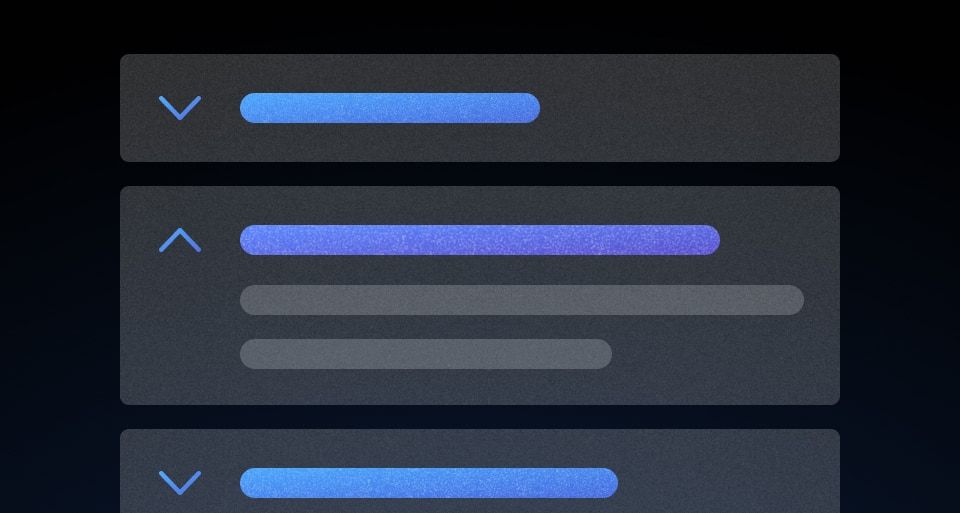
How to use this component
The DisclosurePrimitive component renders an interactive element that triggers a custom event handler provided by the :toggle block (passed via hash by Ember). To comply with accessibility best practices, this element is usually a button or a component that renders a button.
When the content is disclosed, the container can be closed by toggling the button (click or enter/return).
Note: MenuPrimitive, another variant of this primitive, includes extra functionality to close the content panel by either clicking outside of the content, or via the esc key.
<Hds::DisclosurePrimitive>
<:toggle as |t|>
<button type="button" >Click me</button>
</:toggle>
<:content>
your content here
</:content>
</Hds::DisclosurePrimitive>
Content positioning
The :content block is not positioned in relation to the :toggle block.
Component API
<:toggle>
named block
A named block that works as "toggle" for the DisclosurePrimitive.
[:toggle].onClickToggle
event handler
A function to be called by the interactive element to toggle visibility of the content.
[:toggle].isOpen
tracked property
Hook into this tracked property to access the state of
isOpen.
<:content>
named block
A named block for the content that is shown/hidden upon toggling.
[:content].close
function
A function to programmatically close the DisclosurePrimitive.
isOpen
boolean
- false (default)
Toggles the visibility of the content when the toggle button is interacted with. To display content on page load, set the value to true.
onClose
function
A callback function invoked when the DisclosurePrimitive is closed (if provided).
onClickToggle
function
A callback function invoked when the toggle is clicked.
…attributes
This component supports use of
...attributes.


